# Introduction
ChartWidget is designed and developed to help the user in visualizing data in any form, style, and combination. The module contains the widget itself (ChartWidget), which is the main component and stores information about data (DataSource), visuals (charts), user interaction (tools), axes, legends, etc.
Geotoolkit contains other widgets as well as individual shapes, but only ChartWidget and chart module allow easy customization, modification and combination of display at such scale. The user no longer needs to create scene graphs themselves, monitor their synchronization or limit themselves to one chart. All elements of the module are standardized and require minimal user intervention.
This guide will show the basic settings and principles of the module, allowing the programmer to achieve the display he needs.
# Basics
Let's start by building a simple widget with one chart. Creating a scene usually consists of two short stages. First, you need to setup axes with their location, limits, titles and other settings (to learn more about its settings check the axes tutorial):
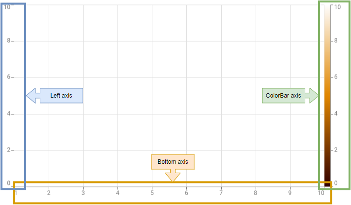
The second step is to add chart(s) indicating the visualization type, styles, and connected axes with which the model space is synchronized and displayed.
Adding multiple charts renders one chart above the previous one. If multiple charts are connected to the same axis, it automatically shares model space (more info at axes tutorial).
All visualizations differ in the type of chart given. All types have both individual and common parameters listed below:
seriesproperties contains data series information used in the visualization. For example,xandydata identifiers for LineChart orleftandrightfor TornadoChart. It could also contain id of the datatableto use and selection series to store and share selected samples. For more information, check our selection guide.axesproperties are used to connect chart with existing axes on the widget. This allows, firstly, to display corresponding values for the user on the axis. Secondly, it allows to position the visualization according to the widget model (e.g. rotated). Check axes guide for more information. In addition, all visualizations automatically adjust to the axis settings, e.g. with neat limits. Lastly, charts sharing the same axis automatically share the same model space with each other.
Since every axis can be referred using unique id, it is usually used to connect x, y and z (color) dimension(s). However, some charts can't be connected to model space and has unique positioning settings, such as DonutChart. Check the according chart type tutorial for more information.tooltipproperties for this specific visualization. By default, widget tooltip is created as a combination of information from its charts. This settings help to style the data in a certain way, highlight the most important parts or disable tooltip all along. However total result of the visible tooltip is determined by widget and its settings. Check tooltip guide for more details and examples.legendproperties to customize legend items created automatically for the default widget legend. It uses built-in interactive selection for the according data series and is able to show relevant charts information (e.g. current selected value). Check legend tutorials for more details.
# LineChart
LineChart
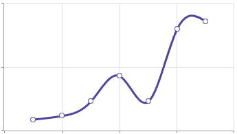
LineChart as Spline
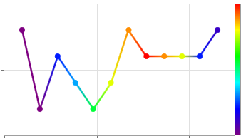
LineChart 3D
LineChart connects series of data points with a straight line (by default) or a spline (use spline flag to enable). The data typically consists of:
- x-series with values on the horizontal axis. This series can be skipped to automatically generate 0, 1, 2, … data.
- y-series with values on the vertical axis. This series is mandatory and can be either a single data set or an array. In the latter case, several polylines are built (one for each set) with shared x-series values. In addition to the data itself, the style of the corresponding line is described here (
linestyleandfillstyleif exists), as well as symbol styles if each data point should be additionally depicted with a symbol shape. - z-series contain additional values to display the third dimension with color. It has the same array length as y-series and the result colors will be determined by connection to colorbar z-axis.
In addition to the data series, the chart parameters include settings for default and selected symbols (applied to all y-series at once), optional baseline line, spline flag and more.
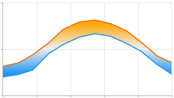
AreaRangeChart
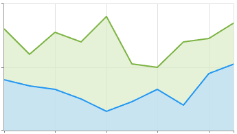
AreaChart
The chart also has two inheritors: AreaRange and Area charts. To use them, you need to set the appropriate chart type. The first is designed to display exactly two y-series and has a fillstyle for filling area between them. The latter works with any number of series, filling the space between it and the baseline. In this case, the fillstyle is specified for each y-series separately, similar to the linestyle.
# Bar Chart
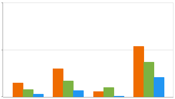
BarChart
Stacked BarChart
FloatingBarChart
BarChart displays discrete categorical data with rectangular bars with lengths (heights) proportional to the values that they represent. The data typically consists of:
- x-series with (optional) positions of the bars. If not specified, bars are distributed evenly. It can also be array of strings, in which case it represents labels of the specified default positions.
- y-series with values for the bars. If two or more series are presented, they are grouped according to x-positions. Each series also contains settings for line and fill styles, as well as bar visibility.
Options also include the source data mode, stacked flag, and reference line settings. FloatingBarChart type is used for exactly two y-series, displaying bars between the corresponding values.
# Bubble Chart
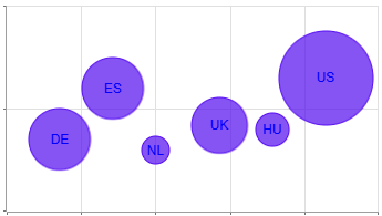
BubbleChart with Labels
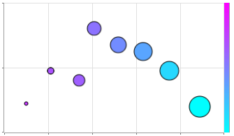
BubbleChart 4D
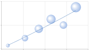
BubbleChart with TrendLine
BubbleChart is used to visualize three (optionally four) dimensions of numerical data. Each triplet in a chart corresponds with a single data point (bubble), and the values for each point are indicated by horizontal/vertical position and the dot size. The data typically consists of:
- x-series with horizontal positions of the bubbles.
- y-series with vertical positions of the bubbles.
- s-series with (optional) size values of the bubbles. The final size for each bubble is calculated based on the min/max data limits of this series, as well as the
minsizeandmaxsizechart parameters for the bubble size of the minimum and maximum values respectively (in pixel). - z-series with (optional) color values of the bubbles. For proper coloring the chart must be connected to a colorbar z-axis.
Options also allow user to setup linestyle and fillstyle (if no z-series provided), enable and customize the trendline, display labels for each bubble, and more.
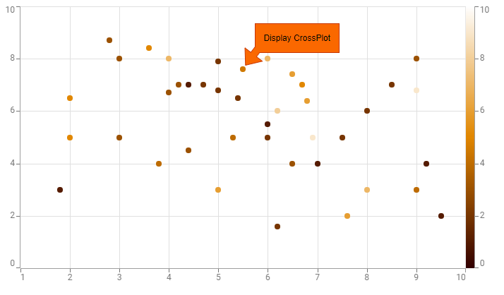
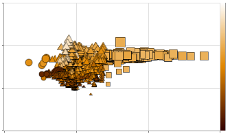
# CrossPlot
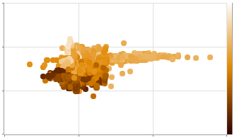
CrossPlot
CrossPlot 5D
CrossPlot with Histograms
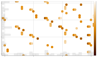
CrossPlot is a scatter chart that displays up to five data series and their relationships. Each set of values is represented as a point with varying horizontal / vertical position, symbol size, color or its shape. The data typically consists of:
- x-series with horizontal positions of the points.
- y-series with vertical positions of the points.
- z-series with (optional) color values of the points. For proper coloring the chart must be connected to a colorbar z-axis.
- size-series with (optional) size values of the points. The final size for each point is calculated based on the chart
sizeparameters, which consists of themin/maxdata limits for the series, and theminsymbolsizeandmaxsymbolsizevalues of the minimum and maximum point sizes respectively (in pixel). - symbol-series with (optional) symbol shape values of the points. Each shape is determined using chart
symbolparameters, which consists of the default styles (linestyle, fillstyle, size, painter, etc.) for CrossPlot points, as well as thepaintersandrangesarrays. First lists custom painters to be used for the shapes, while the latter sets unique value (number) or data range (array of two numbers) for the corresponding painter to be applied. If point's symbol-value doesn't match any ranges or unique values listed, the default painter is used.
CrossPlot also supports histogram options, that allows user to display up to three (x, y, z) histograms showing the frequency of data points in the current visible area along the corresponding axis. Those histograms are not considered separate charts and are part of the CrossPlot since they are plotted on the same data. However, each of them can be customized individually, including line and fill styles, binstep, etc.
# Density Chart
DensityChart
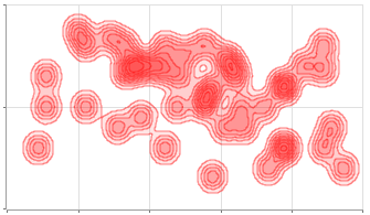
DensityContourChart displays contours that corresponds to the density of the plotted points. The points themselves are not displayed (combine with CrossPlot for that). The data typically consists of:
- x-series with horizontal positions of the points.
- y-series with vertical positions of the points.
Options also support line and fill styles (for custom coloring chart can be connected to a colorbar z-axis instead), density grid settings, geometry mode and more.
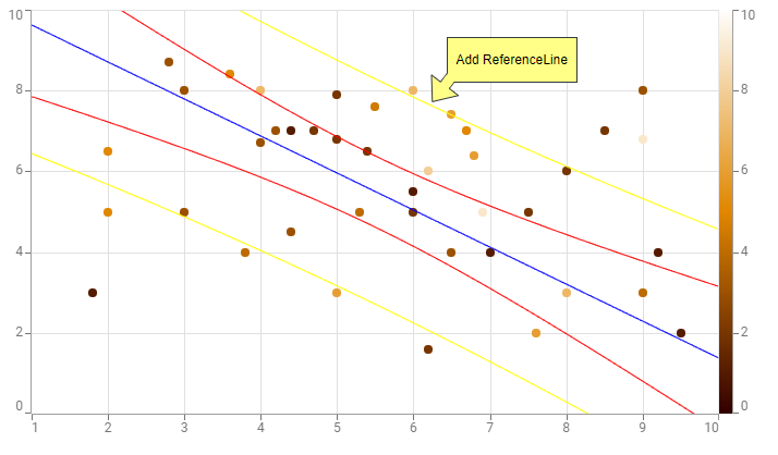
# Regression Line
RegressionLine
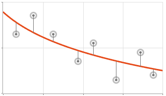
RegressionLine displays a line (Linear by default, Logarithmic/Polynomial/Exponential and other modes are supported) that depicts the correlation between two variables (x and y). The data typically consists of:
- x-series with horizontal positions of the points.
- y-series with vertical positions of the points.
- weight-series with (optional) values of the weight of each point.
Options supports customization of up to five different lines (regressionline, upper/lower confidenceline and upper/lower predictionline), each having its own fillstyle, label, probability properties and more. Chart also supports residualline (line connecting data point with regression line) with points connected perpendicularly, vertically, or horizontally.
# Error Chart
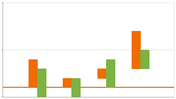
ErrorChart with BarChart
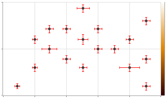
ErrorChart with CrossPlot
ErrorChart is used to show the extent of uncertainty in data relative to an average value. The points themselves are not displayed (combine with CrossPlot for that). The data typically consists of:
- x-series with horizontal positions of the points.
- y-series with vertical positions of the points.
- z-series with (optional) color values of the points. For proper coloring the chart must be connected to a colorbar z-axis.
- dx-series with uncertainty by x (horizontal) values. This uncertainty will be displayed using chart
symbolproperties with horizontal scale (size) calculated usinguncertaintyx options. It hasmin/maxuncertainty data limits,minsymbolsizeandmaxsymbolsizevalues of the minimum and maximum sizes respectively,modelflag for device/model size modes, and more. - dy-series with uncertainty by y (vertical) values. This uncertainty will be displayed using chart
symbolproperties with vertical scale (size) calculated usinguncertaintyy options. It hasmin/maxuncertainty data limits,minsymbolsizeandmaxsymbolsizevalues of the minimum and maximum sizes respectively,modelflag for device/model size modes, and more.
# Histogram
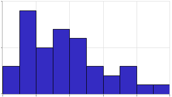
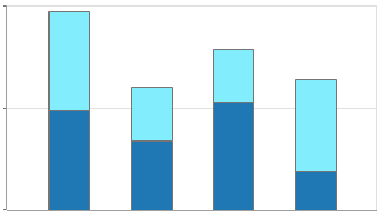
Histogram
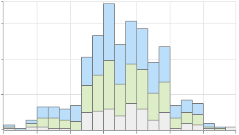
Stacked Histogram
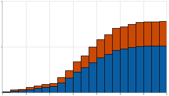
Accumulated Histogram
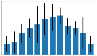
Histogram is a chart that visualizes frequency distributions with rectangular bins with lengths (heights) proportional to the frequencies of the values they represents. The data typically consists of:
- y-series with array of data series to be distributed. Each series is represented as a separate histogram with its own
linestyleandfillstyle. Every subsequent histogram plots its bins on the previous one, thus creating a stacked chart if two or more data series are provided.
Chart options also has other setting shared among all the histograms, such as number of bins, space between the bins, accumulation flag (height for each bin is accumulated from min to max) and chart vertical scaling using frequencytype:
- Absolute type sets bin height to the number of values that fall within the corresponding range.
- Relative type sets bin height according to the proportion (from 0 to 1) of the total number of values that fall within the corresponding range.
- Normalized type sets bin height according to the proportion (from 0 to 1) of the largest bin that fall within the corresponding range.
# Heatmap
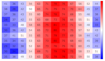
Heatmap
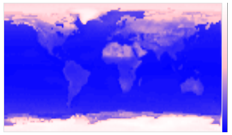
Heatmap with Large Dataset
Heatmap chart represents values for a main variable of interest as colored squares in a two-dimensional grid across two axis variables. The data typically consists of:
- x-series with variables (annotations) for heatmap horizontal positions.
- y-series with variables (annotations) for heatmap vertical positions.
- z-series with data values to be represented data by colors. Due to the nature of the heatmap it should have X*Y values, where X is the number of values in the x-series and Y is the number of values in the y-series. For proper coloring the chart must be connected to a colorbar z-axis.
Options also support custom grid size via rowsize property (columns size is calculated automatically as z-series length / rowsize), labels property (show heatmap values in each grid cell), vertical and horizontal values interpolation types, and more.
# BoxPlot
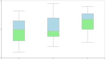
BoxPlot
BoxPlot with Groups
BoxPlot uses boxes and lines to depict the distributions of one or more groups of numeric data. The data typically consists of:
- x-series with horizontal positions (annotations) for the boxes
- y-series with one or an array of data series containing the values for each box. Each data set might have
linestyleandfillstylespecified for displaying that box, and have unique (optional) name for the group purposes. - group-series allows boxes to be grouped (optional). To do this, here must be specified an array, each element of which will list the unique names of the boxes corresponding to one of the groups. For example,
[["A","B"],["C","D"]]group-series would create a chart with two groups, first of which will contain boxes namedAandB, and the second group havingCandDboxes.
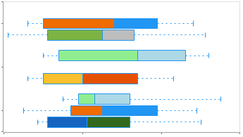
# Tornado Chart
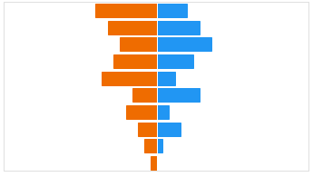
TornadoChart
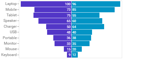
TornadoChart with Labels
TornadoChart is a diagram displaying data across two bar charts, each bar represents the value of the independent variable. The data typically consists of:
- left-series with values for the bars on the left side of the chart. It also includes
linestyleandfillstylefor the bars,textstylefor the labels (if enabled), number for the expected maximumlimit, and more. - right-series with values for the bars on the right side of the chart. It also includes
linestyleandfillstylefor the bars,textstylefor the labels (if enabled), number for the expected maximumlimit, and more.
Options also support linestyle for the central line between the halves, data sort modes, label settings (drawlabels to show values text, labelposition for the text placement, etc.), autogradient mode for fillstyles, and more.
# Donut Chart
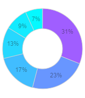
DonutChart
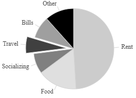
PieChart
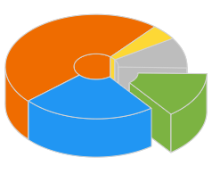
DonutChart 3D
DonutChart and PieChart are used to represent data in a circular form, with each slice of a circle representing a fraction or proportionate part of the whole. Unlike PieChart, DonutChart has a hole in a center (similar to a donut). Aside from that, both charts have the same settings and series options. The data typically consists of:
- x-series with values for the chart to represent.
The options object contains settings for slice fillstyles or colors (for a custom callback), labels (data values are shown by default), rendering mode (2D or 3D view), slices startangle (in degrees) and direction, data sorting order, and more. Due to the nature of the charts they can't be connected to axes, so positioning settings include:
- x-value for the horizontal position of the chart center (in pixel by default, supports percentage string e.g.
50%) - y-value for the vertical position of the chart center (in pixel by default, supports percentage string e.g.
50%) - innerradius for the size of the inner circle, DonutChart only (in pixel by default, supports percentage string e.g.
50%). - outerradius for the size of the outer circle (in pixel by default, supports percentage string e.g.
50%).
# Radar Chart
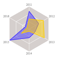
RadarChart
RadarChart displays multivariate data stacked at an axis with the same central point. The chart features three or more quantitative variables for comparison. The data typically consists of:
- y-series with one or an array of data series for the chart to display. Each series has its own
linestyleandfillstyle, and the size of each series should be the same as the number ofcategoriesrepresented by the chart.
Options have names of the displayed categories (the number of which determines the final form of the chart), each being valued from 0 to modelradius. User might customize chart fillstyle and linestyle, style for the labels (names of the categories are displayed), startangle for the first category initial position (in degrees), and more. Due to the nature of the chart it can't be connected to axes, so positioning settings include:
- x-value for the horizontal position of the chart center (in pixel by default, supports percentage string e.g.
50%) - y-value for the vertical position of the chart center (in pixel by default, supports percentage string e.g.
50%) - outerradius for the outer size of the chart (in pixel by default, supports percentage string e.g.
50%).