# Overview
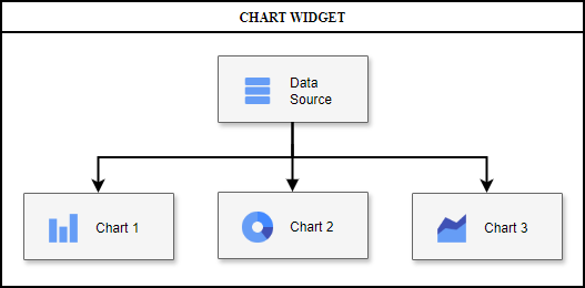
DataSource is a unique object that stores all ChartWidget data and distributes this data to charts for display. This object can be created automatically and filled as data arrives, or set manually. In the latter case, user can use the same DataSource instance on two (or more) widgets, managing data and selection synchronization between them.
# Data Tables
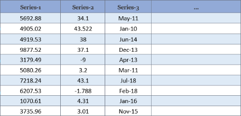
DataSource stores data as a set of tables (geotoolkit/data/DataTable) with a unique identifier, each of which in turn is a set of DataSeries (geotoolkit/data/DataSeries) columns storing data array of the same type:
Each chart is built using data from one of the tables, the identifier of which is specified in the table field of the series options. Each data series (x, y, etc.) of the chart is a string identifier linking to a data series in this table. Thus, the user does not need to re-specify data for each chart, and can also freely switch the display from one data table to another (see example here).
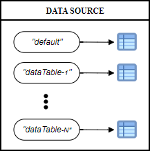
If no table identifier is specified, both the chart and DataSource use the default identifier. Other tables can be added and removed using the add, set and remove methods. If one or more data series are missing to display the visual, the chart will be temporarily hidden and will reappear as soon as the data is updated and ready.
# Selection States
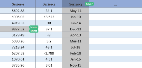
Besides separating data information from display style and ease of charts creation, DataSource has the purpose of synchronizing charts with each other. To do this, it stores selection states that are applied on the stored data, which can be done by any connected chart (or user), and which other charts can see and react to:
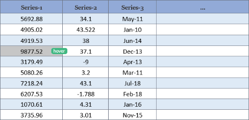
An arbitrary string is used as a state, so the user can enter new states by writing their own logic for reacting to it. By default, ChartWidget supports two main states: hover (applied by charts when the mouse hovers over the sample) and selection (when clicking on it). For ease of reaction customization, the corresponding styles can be customized using CSS with the applied state, for example *[cssclass="linechart-series"]:hover. For a more detailed description and examples, see the corresponding chart tutorial.
DataSource supports selecting an arbitrary number of states per data sample, and can also apply a state to the entire dataseries (for example, highlighting the LineChart's polyline instead of a specific points):
By default, all charts added to the same ChartWidget are synchronized. To avoid this, you can use different selection identifiers for the chart (property of the series options). Each selection stores a "snapshot" of the states on the data. So for example, user can easily synchronize Chart-1 with Chart-2, and Chart-3 with Chart-4 so that the pairs are not synchronized with each other. To do this, just specify matching selection identifiers. The default selection has the default identifier.
To start managing the SelectionSeries instance, use the DataSource getSelection method. After that, the user will have access to operations on selection, such as:
selectto add the selected data series and samples with the string state provided. It is important that if a specific series identifier is not specified, the selection applies to all series in the table. The same principle applies to all other operations listed below.setSelectionto overwrite the selection for the string state provided.toggleto change the state of the selection with the string state provided. In case of an empty indices array, the entire data series selection will be toggled. Each sample is toggled separately, i.e. the call can simultaneously turn on unselected indices and turn off selected ones.deselectto remove selection of data with the string state provided.clearto deselect all data and all states (or one state if string state provided).getSelectionto get all selected series and indices for the string state provided. Does not include series names selected in an unspecified manner.getIndicesto get the selected indices of the series for the string state provided.getRawSelectionto get the selected indices of the series for the string state provided. Supports non-integer indices selection for charts such as LineChart that can select between samples.isEmptyto check for the presence of selected data for the string state provided.isSelectedto check that all passed series and indices were selected for the string state provided.containsto check that some passed series and indices were selected for the string state provided.
# Selection Tool
ChartWidget has the default behavior based on built-in tools for its selection and highlighting. The user can customize the behavior logic, but for convenience the highlighting process was split into the following customizable components:
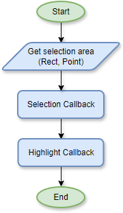
SelecitonTool is configured by default to respond to mouse events (such as mouseover, leave, click, etc.), which triggers the following algorithm. First, the required selection area is calculated (by default, a point; in rubberband or a specified selectionmode, a rectangle). After that, the information is processed by the custom callback of the ChartWidget selection options.
The default callback is also exported from the module as defaultSelectionCallback so that if the user needs to change a small detail (like disable on condition) there won't be a need to rewrite the function for the user. The purpose of the callback is to get the selected data under the mouse (or as a result of an event) point or the lack thereof. The same callback is used to manage the tooltip, you can read more about it here.
The calculated selection data is then process by the highlight callback on the ChartWidget, whose purpose is to apply the selection to the DataSource. Similar to the selection callback, this method can be changed by the user, and the default behavior is exported from the module as defaultHighlightCallback. This behavior can be described as follows:
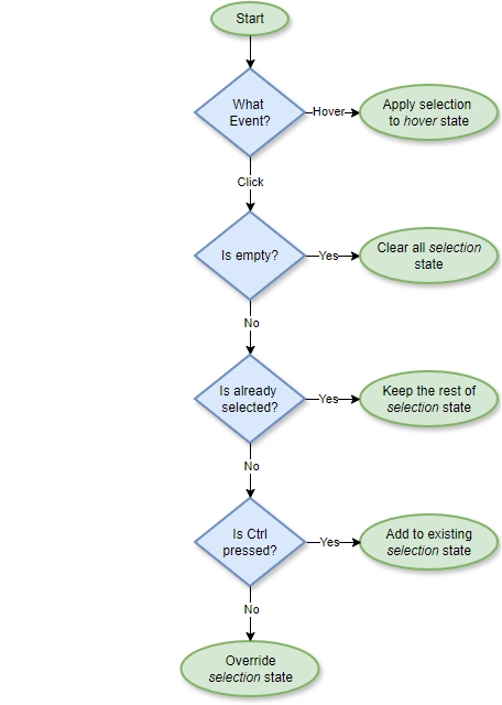
As you can see, it only applies the hover and selection states. In case a different behavior is required, the user only needs to change this callback without affecting the selection calculation algorithm. And vice versa, the selection logic can be changed without changing the applying states.