# Overview
ChartWidget is an inheritor class of AnnotatedWidget, so the visible area consists of nine annotations areas (see geotoolkit/layout/AnnotationLocation). While the visual of the charts is in the Center annotation, the axes can be located in the West, East, South or North. The location of the axes itself does not affect the model with charts (besides the measuring visual), but can be taken into account by the charts when connecting to them (see more details at Rotation).
Connected axes and charts are synchronized automatically, there is no need to do it manually. Thus, the created chart will display relevant values on the axes based on the provided data of this chart. When connecting several charts to one axis, the model space will be shared (for example, a chart A with 0–50 horizontal values will be on the left, a chart B by 50–100 values will occupy the right half, and the axis itself will automatically display values from 0 to 100). Synchronization also works in the opposite direction. Setting the limits on the axis directly affects the visible area of connected charts (for example, if in the previous example axis limits are manually set the to 25–75, user will see only the right part of chart A and the left part of chart B).
To add axes to the widget, user can use the addAxis/insertAxis methods, or specify them in the axes property during initialization. This object is a Record having unique string identifier of the axis as keys with the value being settings of said axis. The basic axis settings include but are not limited to:
locationcontains one of four possible annotations for axis placementmin/maxis a numerical limit for the displayed model range. If neat limits are enabled (seedimension), the value is taken into account as a data limit for calculations.dimensionhas axis mapping dimension instance or options. It is used to setup axis limits. For example,{'neatlimits': true}flag enables calculation of recommended (rounded, nice, etc.) axis limits based on the data range, device size, etc.labelscontains string array, used to quickly and easily configure the tick generator. Creates a simple counter generator (0, 1, 2, etc.) and places provided labels at the corresponding ticks.tickgeneratorhas axis tick generator instance or options. Overrideslabelsproperty and can be used for more precise and complicated setups.gridcontains settings for the grid connected to the axis. The default grid copies tick generator from the axis and extends its ticks to the visible area (center model) with charts. Can be configured or, for example, turned off using{'visible': false}option.titlelets user show and configure the text title above (next to) the axis.typeoption changes axis type. Currently two axis types are supported, default andColorBartype. The latter changes axis visual, showing specified color provider and adds the ability to connect it to chart as a z (color) axis. More types might be added into the future.datatypechanges the data type (e.g. tologarithmic) of the corresponding model space, affecting ticks, charts, etc. See more details at logarithimic examplevisibleflag can be used to hide the visual while keeping the benefits of having it (e.g. charts model space management).
# Rotation
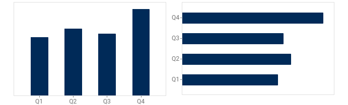
The location of the axes not only directly indicates the position of the visual, but can be used to change (rotate) some charts. For example, if you specify the vertical axis as the x axis and the horizontal axis as the y axis, the chart will automatically recognize this and rotate. At the same time, do not forget that if the axes are parallel to each other, the configuration will be inconsistent and the chart will not be displayed until the mistake is corrected.
# Axis Type
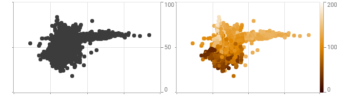
The axis visual is usually a straight ruler with generated ticks to display the model space, their corresponding values, a possible title, etc. Such axes have the Default type and can be connected to most charts as an x or y axis. Connecting the z axis is different, however, since this (third) dimension is responsible for color, the axis requires additional settings. For this, there is a ColorBar axis type.
When this type is specified, additional elements appear near the axis - in particular, a colorbar located between the axis and the widget model space. This type works similarly to regular axes, for example, automatically calculating its min/max range based on the data limits of the connected charts. Connected charts do not change their model space, but use the colorprovider of the connected axis for visualizing. The tick generator, title, etc. are configured similarly. But additional options also appear, such as:
sizeis the width of colorbar visual (in device).colorproviderprovides color distribution for both the axis colorbar and directly to all connected charts for coloring.
In addition, interactive tools are automatically created for ColorBar axes for user convenience. Thus when selecting a value on the chart, a special cursor will highlight the corresponding value on the color bar (similar to how crosshair tool does it for other axes). In addition, the ColorBar axis supports drag-and-drop interaction, creating floating colorbar visual that can be moved above the widget and placed back in each of four available widget annotations.
# Flip
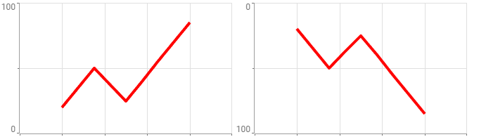
The flip flag allows user to customize the axis direction (up-down for vertical and left-right for horizontal). All additional elements such as generated ticks, attached grid and connected charts are automatically synchronized. Combined with axis positioning (see Rotation), this allows any chart to be positioned on any side and in any direction.
# Logarithmic Mode
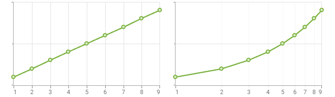
One of an axis tasks is to represent the model space associated with it. In some cases, it is more convenient to move away from the normal linear space and display values in logarithmic form. For this, the datatype parameter is used, which affects both the axis itself (ticks, grid) and all connected charts. This allows you to change the visual representation quickly and easily without having to manually calculate the changed data, set it on charts, or calculate new neat limits.
Each axis is individually configurable, so you can logarithmize the horizontal direction without affecting the vertical, or the z-dimension without changing the others. More data types are planned to be added in future releases.
# Actions
The created axes are not set in stone and can be changed after creation. For this purpose, a number of widget methods have been implemented:
addAxisto create new axes, you can also useinsertAxisto insert axes at a specific index. Unless otherwise specified by the user, the required annotation sizes to display all axes, titles, etc. are calculated automatically.removeAxissimply removes axis from the widget. All connected charts reset the calculated limits by expanding to the entire visible space (default scale), so if you want to keep the current behavior, it is best to switch the axis usingvisible: false.setPropertiesreceives an{'axes': …}object and allows user to override the settings received during initialization.swapAxesallows user to change the location of the two provided axes, including the rotation of all connected charts and more. The ability to swap axes can be tested using thecanSwapAxesmethod.